
Author: zenish
How To Use The Customer Buying Cycle To Get More Customers
Here is a great article on ##How To Use The Customer Buying Cycle To Get More Customers….
Learn how at https://mayerdigitalagency.com/blog/how-to-use-the-customer-buying-cycle-to-get-more-customers
How To Do Marketing During The COVID-19
Check out a great article on marketing during the coronoacirus outbreak. Read more here How To Do Marketing During The COVID-19
Is Brand Awareness A Sham Article
Check out this article on Brand Awareness… Brand Awareness Marketing – Is Brand Awareness A Sham?
5 Powerful Marketing Principles Article
Here is the link to a good article on Marketing. Check it out here > 5 Powerful Marketing Principles Article
Google Ads Search Certification

Google Ads Search Certification
We have recently become certified with Google for AdWords and Search.



Invention – Photography & Videography
Photography & Video
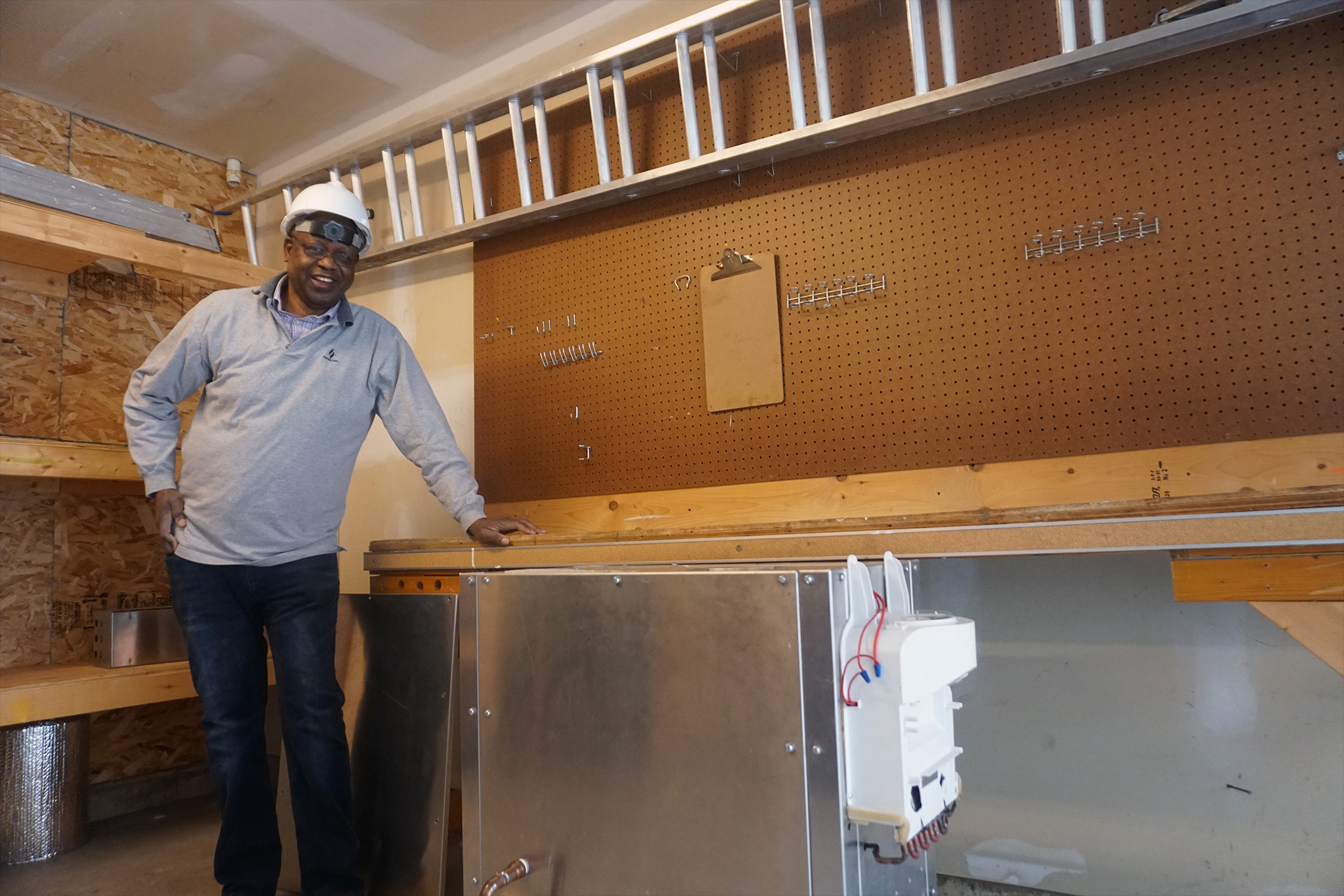
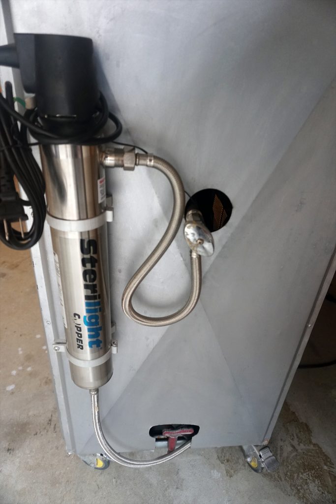
We were lucky enough to work with a local Inventor who was looking for some Photographs and some Video. Due to the nature of possible proprietary rights most of the Photographs and the Video cannot be displayed at this moment.
While we are able to storyboard and craft more intensive photograph shoots and marketing videos, our client had allocated a specific set of money for the budget and this called for making the right decision. In the end some straight up straight forward simple photographs and video was the right call.
We arrived with our 24MP SONY and 4K Camera and Lights. We then took assessment of the location and took a look over the inventions to try and figure out what would be the best solution. In the end the best plan, working within the budget and the size of the devices, was to shoot on location.
Photographs and Video aren’t all about the subject or lighting or special techniques or angles. While these are of course important, it is often some of the other things that contribute to poor photographs that often get overlooked. The background always plays a critical role. In this instance we spent some time cleaning up and organizing the location and strategically placing a few things to help with the set. This helped to create a better atmosphere and mood that helped to communicate and display the inventions.
We then got to work, shooting plenty of photographs and video. We then used Photoshop & DaVinci Resolve to edit and render each. We provided our client with standard edited photographs and more impactful and aggressively edited photographs. We then edited the video to provide transitions and color correction.
We finished by providing the client our standard Disc Package along with an electronic transfer. We also of course backup all of our own work. This also comes with a friendly contract that transfers the Copyright and Ownership to the client which also provides a bit of security for each party.
In the end we were able to feel as if we helped someone perhaps get more then someone else would have done for them. Oftentimes many designers, photographers, videographers wont work to budgets or make compromises in their application of skills and techniques in order to achieve similar High Quality results. We also didn’t guarantee more then we could deliver and warned that any marketing video to any worthwhile competency would be more then the budget at hand. This made slapping or chopping together a low budget marketing video not an option and a simple more standard display video was suggested and ultimately delivered.
It was also a fun time meeting a local inventor working on something extremely important. Desalination is a critical thing for our future of water and we were lucky to help someone invested in that exact thing.

If you are in need of Photographs and Video, regardless the budget, please give us a chance, we aim to please.

Wigs By George Logo
We were tasked with the upgrade and modernization of the Wigs By George Website. On the old website there was an old logo. We decided to go ahead and update that logo. We were given free reign to come up with something and we went to work.
We had taken into account George’s old site and logo, our Owner had met George, and we were able to get a sense of overall style and feel of him and his business. We then took a moment to look at his clients and the market and industry and made a few decisions on the direction we wanted to take.
In the City of Victoria there are a few different trends and styles going around, that are similar to trends and styles overall within the design game. We wanted to stand out yet fit in. We wanted to add some sophistication and class however while making it very easy to read. We decided not to try and incorporate anything about wigs however we wanted clean large and bold yet elegant and gentlemanly with a nice Wordmark Logo.
We came up with a few different ideas (not shown here) and in the end we decided on the collection of Logos below. We made a favicon that would be easier to see small, and a few different options including a slogan and different colors.
Awaken Healing Arts Logo Process
Here is the end result of this design process. 1 Main Awaken Healing Arts Combination Mark Logo.
The Awaken Healing Arts Logo Process
This process began with the need to create a Main Logo for Awaken Healing Arts. We began with a very clear direction in mind and a client who had a few ideas of what they wanted. Normally we start with sketches and ideas and this time was no different. We basically started with the overall genre of the business and took a look at the industry and the image and style of its owner. We knew Awaken had some specific ideas however we also wanted to make an attempt at wowing with something different and original as we would normally brand and design for someone. Being a healing arts company and Reiki based, we decided on attempting to incorporpate some images that would help communicate the best message to potential customers and clients. Being a start-up we had to take the approach of trying to draw people with their first look at the logo, whether big or small, and communicate through image and text what Awaken was all about.
Below we can see a bunch of sketches of our attempts with no input from the owner. We had a few ideas. We wanted to convey a more zen like feel to it. We also wanted to incorporate the chakras and/or possibly something to do with the awaken like the Sun or another bright and up type of feel.
More then anything we wanted it to be streamlined, classy, simple, clean, bold yet still effectively communicate the Reiki aspect of it. We had decided that to best position Awaken within their industry and to set them apart from the competition, taking into account the Owners style, a bit more modern and classy business like Logo would best help to communicate the proper message.
Ultimately simple lines and shapes reflecting meditation and chakras became our preferred choice.
Left you can see 3 sheets of sketches and different ideas. The 3rd sketch sheet is done to a bit higher standard and took the best of the first two sheets. We decided to start from fresh in a vector program as opposed to scanning and tracing.
The client wanted Black & White and below is the final True Mint Blueprints attempt at Awakens Main Logo, at least this was our first submission in finished quality for client review.
We also wanted to be a bit smart and clever and extract from within this Logo a Lettermark that could mostly be used as a favicon. Here you will notice the A centered with 2 of the chakras that have a different opacity then the rest.
Evaluation
We were aware the client had their own idea and vision, we merely wanted to showcase and display what our first attempt at a Main Logo would be, for various reasons.
While the client liked what we did ultimately it wasn’t what they wanted, and we moved on.
This is part of the process and obviously we sucked it u, stayed positive and focused on making the clients vision come to lifeOur client had a few different ideas and we made some more sketches and made some fresh in a vector program essentially hoping to strike gold and find the right design that would make our client happy.
Above are some sketches and below are a bunch of different attempts, mostly first attempts that were then submitted for evaluation.
As you can see we certainly came up with a few different logos. Lots of different styles however often very similar.
Our client was focused on a Lotus flower image and we obviously agreed that a Lotus was certainly representative of the genre and style. We did our best to offer our suggestions and opinions and of course took our time to add our own style and flare to each one while keeping it within the clients specifications.
Throughout the process we were able to nail down the Font. We also incorporated some color that ultimately found its way into our clients website, that we were also hired to develop and design, but eventually for the logo we stuck with just black and white.
When all evaluations were finished, none of the above were good enough. The process however ultimately helped narrow down the end result and finally the client decided upon the main logo that is being used.
The process was the same and over a few different changes we were finally able to settle on the below final.”Try not to look at us like an expense that costs you money. Almost everything we do for you is an asset which provides equity to your business and can be put on your books. These assets along with your hard work can become extremely valuable.”
Wigs By George Website
Our Owner was lucky enough to play a round of golf with George at the Royal Colwood Golf Club, the Owner of Wigs By George. During the round our company and what we do came up. George ultimately asked our owner about the wigsbygeorge.com website. After a few meetings and some negotiating we finally landed George’s web redesign, modernization and new hosting.
We jumped in and beat his launch date by a few days. Due to old pictures we even tossed in a photo shoot to ensure we had the right material to best showcase George and his business.
Not only was this a great project for us, George has been an awesome client and we hope you can check out his website and send him anybody you know that needs a Wig or Hairpiece.


