
Google Ads Search Certification
We have recently become certified with Google for AdWords and Search.



We have recently become certified with Google for AdWords and Search.


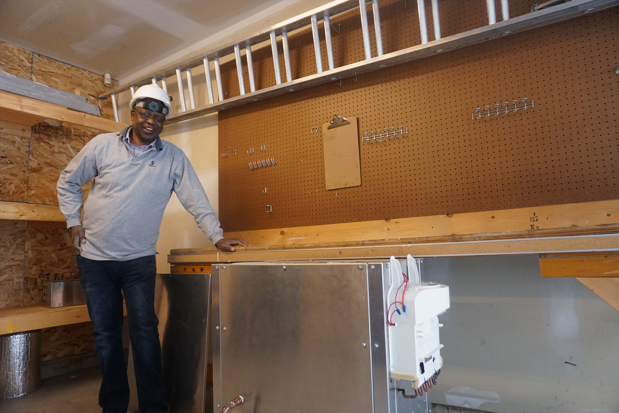
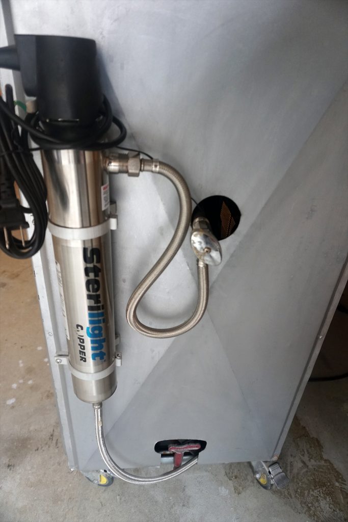
We were lucky enough to work with a local Inventor who was looking for some Photographs and some Video. Due to the nature of possible proprietary rights most of the Photographs and the Video cannot be displayed at this moment.
While we are able to storyboard and craft more intensive photograph shoots and marketing videos, our client had allocated a specific set of money for the budget and this called for making the right decision. In the end some straight up straight forward simple photographs and video was the right call.
We arrived with our 24MP SONY and 4K Camera and Lights. We then took assessment of the location and took a look over the inventions to try and figure out what would be the best solution. In the end the best plan, working within the budget and the size of the devices, was to shoot on location.
Photographs and Video aren’t all about the subject or lighting or special techniques or angles. While these are of course important, it is often some of the other things that contribute to poor photographs that often get overlooked. The background always plays a critical role. In this instance we spent some time cleaning up and organizing the location and strategically placing a few things to help with the set. This helped to create a better atmosphere and mood that helped to communicate and display the inventions.
We then got to work, shooting plenty of photographs and video. We then used Photoshop & DaVinci Resolve to edit and render each. We provided our client with standard edited photographs and more impactful and aggressively edited photographs. We then edited the video to provide transitions and color correction.
We finished by providing the client our standard Disc Package along with an electronic transfer. We also of course backup all of our own work. This also comes with a friendly contract that transfers the Copyright and Ownership to the client which also provides a bit of security for each party.
In the end we were able to feel as if we helped someone perhaps get more then someone else would have done for them. Oftentimes many designers, photographers, videographers wont work to budgets or make compromises in their application of skills and techniques in order to achieve similar High Quality results. We also didn’t guarantee more then we could deliver and warned that any marketing video to any worthwhile competency would be more then the budget at hand. This made slapping or chopping together a low budget marketing video not an option and a simple more standard display video was suggested and ultimately delivered.
It was also a fun time meeting a local inventor working on something extremely important. Desalination is a critical thing for our future of water and we were lucky to help someone invested in that exact thing.

If you are in need of Photographs and Video, regardless the budget, please give us a chance, we aim to please.

We were tasked with the upgrade and modernization of the Wigs By George Website. On the old website there was an old logo. We decided to go ahead and update that logo. We were given free reign to come up with something and we went to work.
We had taken into account George’s old site and logo, our Owner had met George, and we were able to get a sense of overall style and feel of him and his business. We then took a moment to look at his clients and the market and industry and made a few decisions on the direction we wanted to take.
In the City of Victoria there are a few different trends and styles going around, that are similar to trends and styles overall within the design game. We wanted to stand out yet fit in. We wanted to add some sophistication and class however while making it very easy to read. We decided not to try and incorporate anything about wigs however we wanted clean large and bold yet elegant and gentlemanly with a nice Wordmark Logo.
We came up with a few different ideas (not shown here) and in the end we decided on the collection of Logos below. We made a favicon that would be easier to see small, and a few different options including a slogan and different colors.
Here is the end result of this design process. 1 Main Awaken Healing Arts Combination Mark Logo.
This process began with the need to create a Main Logo for Awaken Healing Arts. We began with a very clear direction in mind and a client who had a few ideas of what they wanted. Normally we start with sketches and ideas and this time was no different. We basically started with the overall genre of the business and took a look at the industry and the image and style of its owner. We knew Awaken had some specific ideas however we also wanted to make an attempt at wowing with something different and original as we would normally brand and design for someone. Being a healing arts company and Reiki based, we decided on attempting to incorporpate some images that would help communicate the best message to potential customers and clients. Being a start-up we had to take the approach of trying to draw people with their first look at the logo, whether big or small, and communicate through image and text what Awaken was all about.
Below we can see a bunch of sketches of our attempts with no input from the owner. We had a few ideas. We wanted to convey a more zen like feel to it. We also wanted to incorporate the chakras and/or possibly something to do with the awaken like the Sun or another bright and up type of feel.
More then anything we wanted it to be streamlined, classy, simple, clean, bold yet still effectively communicate the Reiki aspect of it. We had decided that to best position Awaken within their industry and to set them apart from the competition, taking into account the Owners style, a bit more modern and classy business like Logo would best help to communicate the proper message.
Ultimately simple lines and shapes reflecting meditation and chakras became our preferred choice.
Left you can see 3 sheets of sketches and different ideas. The 3rd sketch sheet is done to a bit higher standard and took the best of the first two sheets. We decided to start from fresh in a vector program as opposed to scanning and tracing.
The client wanted Black & White and below is the final True Mint Blueprints attempt at Awakens Main Logo, at least this was our first submission in finished quality for client review.
We also wanted to be a bit smart and clever and extract from within this Logo a Lettermark that could mostly be used as a favicon. Here you will notice the A centered with 2 of the chakras that have a different opacity then the rest.
We were aware the client had their own idea and vision, we merely wanted to showcase and display what our first attempt at a Main Logo would be, for various reasons.
While the client liked what we did ultimately it wasn’t what they wanted, and we moved on.
This is part of the process and obviously we sucked it u, stayed positive and focused on making the clients vision come to lifeOur client had a few different ideas and we made some more sketches and made some fresh in a vector program essentially hoping to strike gold and find the right design that would make our client happy.
Above are some sketches and below are a bunch of different attempts, mostly first attempts that were then submitted for evaluation.
As you can see we certainly came up with a few different logos. Lots of different styles however often very similar.
Our client was focused on a Lotus flower image and we obviously agreed that a Lotus was certainly representative of the genre and style. We did our best to offer our suggestions and opinions and of course took our time to add our own style and flare to each one while keeping it within the clients specifications.
Throughout the process we were able to nail down the Font. We also incorporated some color that ultimately found its way into our clients website, that we were also hired to develop and design, but eventually for the logo we stuck with just black and white.
When all evaluations were finished, none of the above were good enough. The process however ultimately helped narrow down the end result and finally the client decided upon the main logo that is being used.
The process was the same and over a few different changes we were finally able to settle on the below final.”Try not to look at us like an expense that costs you money. Almost everything we do for you is an asset which provides equity to your business and can be put on your books. These assets along with your hard work can become extremely valuable.”
Our Owner was lucky enough to play a round of golf with George at the Royal Colwood Golf Club, the Owner of Wigs By George. During the round our company and what we do came up. George ultimately asked our owner about the wigsbygeorge.com website. After a few meetings and some negotiating we finally landed George’s web redesign, modernization and new hosting.
We jumped in and beat his launch date by a few days. Due to old pictures we even tossed in a photo shoot to ensure we had the right material to best showcase George and his business.
Not only was this a great project for us, George has been an awesome client and we hope you can check out his website and send him anybody you know that needs a Wig or Hairpiece.
We were tasked with the full scope branding of Go Between Solutions, a small start-up focused on tech.
What this required was starting from scratch to come up with not only the colors, shapes, fonts and a flashy website, but to cohesively tie everything together into a solid branding. All we had was a company name, some ideas we were vaguely allowed to hear about and the overall ethos of the company.
When tasked with such a project we start with the slogan, then move to the logo, and finish with the bulk of the website design.
We always recommend starting with a slogan once you have a company name. Besides business/marketing plans and policies/procedures, a slogan should be one of the first things a start-up or new business comes up with.
A good slogan will help to formulate the direction and future of your whole company and therefore it’s important to take the time to come up with a great one.
It can also save you money and time in the short and long run if you come up with some strong slogans.
We did our research and had some brainstorming sessions and overall threw a lot of potential slogans to the wall. In this instance the following two slogans stuck.
Slogan #1 – “Solving Today’s Problems With Tomorrow’s Solutions”.
&
Slogan #2 – “Bridging The Gap Between The Present & Future”.
In the end we decided upon Slogan #2 as the one to use as our main slogan, and went ahead with the next step of the design project.[/vc_column_text][/vc_tta_section][vc_tta_section title=”Logo” tab_id=”1474979016000-b7d82cbb-ff6d5775-0ed9″][vc_column_text]Below you will first see the colorful word-mark main logo we came up with for “Go Between Solutions”. This ultimately became their main logo. We decided upon a blue and bright gold color design. While this might look yellow it technically is a bright gold. This was done for various reasons some psychological and some personal preference. Further down the page you can see some of the sketches we did in coming up with ideas.[/vc_column_text][vc_single_image image=”548″ img_size=”full” alignment=”center” onclick=”img_link_large” css_animation=”slideInLeft”][vc_column_text]Often times people stick with just 1 main logo. In this instance ‘Go Between Solutions’ also wanted a black and white logo with a modern yet more traditional feel to it. This logo is intended to be used in different areas for different applications and mediums. They also wanted one that complimented their slogan as opposed to the main one with no slogan. You can scroll down to view some of the scketches we came up with.
Once we finished the pencil sketches we took some felt and did some in better copy. We then actually started a clean document in a Vector Editing Software Program and made it by visual reference. We did it this way as opposed to scanning or photographing the sketch. The finished rendered and final logos can be seen at the top of this page. We decided to make the “Go Between Solutions” website from complete scratch. This ultimately means we start with a completely blank white page and build it up from there.
We wanted a lot of white space and bold colors and movement to catch eyes and maintain appeal. It is meant to be mostly an informative website with the hopes of creating awareness and inspiring communication and interest.
We kept it simple and lean and optimized it for the web.

At True Mint Blueprints we believe Website Optimization is different then SEO (Search Engine Optimization). SEO is ultimately different then an SEO campaign. We also feel both Website and Search Engine Optimization are different then ranking in Google, Bing and Yandex searches. The reality is to rank in Google for most industries and keywords requires a serious dedicated campaign that encompasses more then just your Website. User Experience is another website design area and general technique that is slightly different then Website Optimization and Search Engine Optimization. While these three all have similarities and oftentimes contain similar steps, they all have different steps and ultimately desired outcomes.
Fear not if you are worried about added costs, Website Optimization, SEO and User Experience are all encompassed, at some level, within True Mint Blueprints Website Design.
This article focuses on Website Optimization. SEO is something we include in our Website Design however is not a service to rank you in Google. It is a service designed to give you the optimal chances, and to set your site up, for ranking in Google or Bing.
Here is an example in a tag cloud of different things involved in actually attempting to rank your page
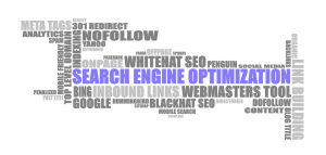
Website Optimization is something entirely different then what could be included within the above tag cloud and SEO. Website Optimization is equally, if not more important, as the design and visual appeal of your site. Without it you will have no chance to rank in Google consistently, effectively and in many cases, at all. Without good design however you will have little to no chance to create a positive experience for visitors. Without optimization you might not even get the chance to show your website off to any visitor, as some will click away within seconds. A good balance of marriage of the two will give you the best overall chances.
It can be difficult to see the forest through the trees and ultimately we have to balance and weigh every decision we make. While Google ranking is important, the Design must always take precedent and come first. While speed is of critical importance it still has to be weighed within the overall plan and intent of the site.
We prefer to focus initially on the Design, making our decisions with that in mind. Once the design is complete then the optimization can happen. It is easier and takes significantly less time if we go in this order. We find it better to work in this manner and ultimately achieve better overall results.
Website Optimization isn’t only about Ranking in searches and ranking in searches is more then just sweet optimization. It takes a whole package of different things in order to rank and sometimes depending on the area or desired thing to rank for, infeasible and essentially impossible, at least long-term. Website optimization is about streamlining and organizing everything. It is about making your site faster and make it more attractive to search engines and some of their ranking calculators.
Therefore all these decisions are balanced and weighed based upon the sites intention and the owners desire. The balance becomes a constant tug of war between what we want to display to the people viewing and what we want search engines and networks to see and compute.
Too much focus on design often leaves a bloated and slow website that ultimately turns viewers away. Too much focus on making Google like your page will result in a page that could lack good design and take the focus away from the intent of the owner and the website. Both are counter-intuitive to the ultimate results desired.
As an example we wanted to share a couple optimizations we did on our Owners personal website Justin Mayer and our Parents Website Sage Hedge Inc.
The look of the sites did not change, their performance and how they are seen by search engines did.
We started by running a few tests.
We will begin with the personal site and share the results of a GTMetrix test.
The first time we ran the scan we came back with these results:
Pagescore F28% – YSlow D66% – Fully Loaded Time 2.7s – Total Page Size – 3.66MB – Requests 119
Those results won’t work.
The average scores based on every test they’ve done are:
Pagescore 70% – YSlow 68% – Fully Loaded Time 7.3s – Total Page Size – 2.74MB – Requests 89
Through some different techniques we were able to get the site to the following score.
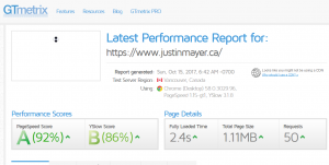
As you can see we are significantly above average!
Now we will share the results of Sage Hedge Inc’s Optimization. We ran tests using 3 different sites.


As you can see not the best overall. We then went to work to Optimize the website through various techniques.
Here is where we were able to achieve without too much effort. More could be done and possibly will, however these numbers are manageable. At some point it becomes overkill and might find yourself focusing on test sites and their numbers, instead of the design, the plan and your visitors experiences. It is important to know, and remember, that these tests are just to give you an idea and a direction. They also tell you where your score suffers and what can be done to improve the score. Not always are the changes the best thing for the website and sometimes can create situations where websites don’t work effective, or at all.


FYI Apples website at the time of this article was Pagescore 82% – YSlow 78% – Fully Loaded Time 1.6s – Total Page Size – 1.06MB – Requests 43.
Apples Googles PageSpeed score is a red “Poor” on Mobile and a yellow 74 “Needs Work” on Desktop.
These scores that we attained through our True Mint Blueprints Website Optimization, are better, and in general, an overall success. Due to various design decisions it can often only be so good. There are also other techniques we have yet to even employ that will likely result in even better scores. Being better then the average across the board is a good start.
If you take a closer look at the second image in the first of the two sequences above, an image of test scores from pingdom, you will see initially a load time of over 7 seconds from Stockholm. If you scroll down to the second sequence of image you will see we improved it to just over 2 seconds from Stockholm.
Sometimes we even see less then 2 seconds, as we do above, on certain tests for the full load time, which is exactly what we want.
This 2 seconds should generally be similar across the Globe and is essential to seeing less people bounce from your site immediately.
Website Optimization is something we include within our design. Guarantees on google ranks or ranking in general is not something included in most website designing and almost always a separate added cost. What we do is get you in the best possible position based on your desires to be able to effectively rank your page and compete in searches. To rank and compete ultimately takes money and a strategy and a larger overall plan. We will make it as fast as possible and optimize it for the present and the future. This will give you the best chance while putting your same good foot forward.
Here is the end result of this design process. 3 True Mint Blueprints Logos.
The True Mint Blueprints Emblem and Logo Process.
This process began with the desire to create a Main Logo. We began with no idea what we wanted. Normally we start with sketches and ideas (not shown here) and this time was no different. We basically doodled using different shapes and ideas. We attempted incorporating different elements as well deciding on a more focused direction regarding branding. In the end we decided that a shape of some design tool was the best decision. While we were at first targeting a combination mark logo in the end it became our emblem. We also came up with the idea of extracting a different logo from the original. Within the emblem (the original) which is part of its true design, can be found a letter-mark logo that cohesively translates our brand while providing diversity and consistency. Also within the Emblem there is our name which became similarly extracted into our main wordmark. We ultimately decided to enhance the wordmark beyond the name in the emblem as opposed to our decision to simply extract identically the lettermark, but this was just at first. In the very end we also chose to enhance the lettermark logo after a variety of attempts. This overall style is done for variety and other print options as well as a means to test market design.
In this instance of design we decided not to enhance the sketches with good copies and instead headed into the computer for trial and error idea generation.While generating ideas we began to play with the idea of creating a different logo for each style in an effort to showcase examples for clients, all of which can be found in this article. <add link[/vc_column_text][/vc_column][/vc_row][vc_row css=”.vc_custom_1506799421456{margin-right: 50px !important;margin-left: 50px !important;}”][vc_column width=”1/4″][vc_single_image image=”9″][/vc_column][vc_column width=”1/4″][vc_column_text]We used some clipart on file and some ugly coloring and undesirable font to quickly give us an idea of what the visual affect would be. We at first chose not to enhance it with original design, nice color and proper font selection in an effort to put the shape to test and evaluation. Knowing we were going for simple and bold color, we chose not to sketch it.
In most cases we do not present clip art with ugly coloring to the client unless specifically requested or else it comes up within conversation and the client wishes to use this technique.
Evaluation
We found that while the colors and the font along with the general clipart nature of the shape were overall unattractive and unappealing, the strength of the basic shape and general idea was enough to cut through even the most hideous and hack design.
This gave us the confidence to go back and begin the process of creating our final design.
We ultimately decided to avoid drawing it by hand or computer and instead chose to Photograph a real design tool and then transfer it to a photo editor and finally a vector program to result in a simple clean original and bold logo.
While there are numerous solutions and various techniques in this case we chose a standard whiteboard.
Needing a flat surface to shoot straight down on with good enough lighting and contrasting colors to help define a good border this method worked great.
We decided to use a real compass that we actually use in design projects for our main shape. We took our 24MP Photographs using a SONY a6300 of a Staedler compass.
We prefer using this method to create or re-create these types of logos unless of course the branding calls for something different. Sometimes it starts and ends with hand sketches, oftentimes the sketches lead into other techniques to ensure the right end result, this was the latter.
We took multiple photographs to ensure we would get the quality we needed. Even though we knew we were taking it into a photo and vector software programs we wanted to make sure we took high quality photos to make the digital manipulation easier.
We took the above photos and transferred them into a Photo Editing Program for cleanup. While this method of transferring speeds up the process of editing it almost always requires working pixel by pixel at some point to do it properly. There are other manipulations that can be done to superimpose a border however we often prefer to keep it authentic and more traditional in nature.
Here you can look at the before and after of the photographs. These were then exported as PNG Files to be taken into a Vector Program.
This was our first exported attempt at our emblem logo. You shouldn’t have to look closely to see vast differences in not only the comparison from the first iteration but also to the finished one being used today.
If you click it to view it large you can see it still needs a lot of work. While we won’t ever send a client a logo in this condition, we oftentimes will render it out so we can view it across different applications before going ahead and doing the finite cleanup work.
We chose some colors and fonts and gave it some time to see how it worked.
This was our first exported attempt at our lettermark logo. As you can see it is a bit different then the current logo in use.
If you notice it is essentially taken from the top of our Emblem logo and then just modified a bit to give it some character.
This is the second rendered version for evaluation.
If you notice there are some changes that can be seen. For one it is significantly cleaner albeit still not in its fully finished state.
Mostly we decided to change the colors and had to take a step back and rethink things. We were going to utilize the web to display vibrant bold colors using RGB. In the long run after some research and study as well further planning we ultimately decided on unifying our brand and scheme across all mediums. We started by choosing finite specific colors and fonts. We also made a long-term decision to stay with CMYK across both mediums. Now it will print as it should and look the same nearly everywhere.
Not even this logo made it passed our final test and Eventually we would change a few things including the font.
Not having liked the initial lettermark we went back to the drawing board. We also wanted to incorporate the “B” in the lettermark and add a bit of interest and depth. We decided to clean up the circle and shape and ultimately make a stronger stand alone lettermark logo.
Eventually we were unable to accept the fonts degradation and overall felt a different font made for a better branding.
Here is the final result.
We decided on three CMYK Color Values and solidified our Typeface of choice. These are decisions that are important to deliberate on as they could be the font/colors of the company and brands whole lifespan.
From the emblem logo creation we were able to extract, modify and enhance a main wordmark logo.
We simply took the text and enhanced it bringing it to the forefront of visual impact. This is actually our advertised and marketed main logo. Because of this we chose to incorporate a subtle yet noticeable emblem design into our wordmark to help carry it across mediums and branding. It allows for more flexibility and diversity while communicating the same message.
We also extracted, modified and enhanced a lettermark logo from our emblem logo. Taking the top circles design of the compass as inspiration we made a circle lettermark utilizing similar design and the same typeface and color scheme. This is a great peripheral logo to display and print offering diversity and options while maintaining a consistent style and branding.
We at True Mint Blueprints believe there are 6 types of logos.
In creating this article to help clients we ultimately paraphrased two articles. These articles are referenced at the bottom of the page. They seem to think there are either 5 or 7. The information they provide is helpful and informative and sound and mostly accurate in regards to the defining characteristics of different logos.
Please use this information and these articles to help you in deciding upon the type of Logo you would like designed. Being certain before we start can save time and money and ultimately result in a better design.
Not sure where to start with your logo design? Maybe you should begin by deciding what style of logo it’s going to be.
Logo styles can be divided into six basic categories: wordmarks, lettermarks, brandmarks, combination marks, emblems and mascots. In this post, we explain how each of them is defined, give some famous examples, and explain when and why you should use them.
(Note: We do not feel there is an Abstract Logo Mark category and each of such a logo can easily be included in one of the other categories. We do feel there are Mascot logos that just can’t be seen as Emblems or Brandmarks.)
A wordmark – also known as word mark or logotype or type cast – is ia very simple clean logo when a Company is name focused and wanting sleek classy easy to read messages. This results in casting the company’s name in text alone. They may be based on handwriting, signatures, custom fonts or (less common) existing fonts.
Famous examples include the logos for Coca-Cola, Disney, Mobil, Canon, Sony, Visa, Google, Facebook, Yahoo and Pinterest.
For big brands, the simplicity of a wordmark logo can convey a sense of confidence, history and stability. However, the wordmark can also be a good choice for a startup, as it contains the company’s full name and helps to make it known.
We often prefer to, depending on the Company Name and initials, include or sketch a Lettermark Logo to complement the Wordmark. While we will instruct a client to focus on one main branding, it never hurts to have peripheral logos and various alternatives. This will help in the long-term by providing strong options which can help a company or start-up change when necessary or offer different looks and/or products or marketing materials. It can also save time and money by allowing them to use something quick and easy for future campaigns instead of having to pay for the whole creation of another Logo.
Also known as a monogram logo, a lettermark logo is again made of text, but based on the initials of the company or brand, rather than its full name. Famous examples include the logos for Cable News Network (CNN), Home Box Office (HBO), the National Aeronautics and Space Administration (NASA), Procter & Gamble (P&G), and Electronic Arts (EA).
As these examples suggest, a lettermark is a good choice for a company whose name is difficult to pronounce, or too long to work as a logo in most media. This is an especially important consideration when it will need to shrink down to tiny sizes on mobile devices, for example.
Shortening a long company name to initials will also make it easier for your audience to remember your logo and name, especially in global markets.
The challenge for some, with both lettermarks and wordmarks, however, is to make them distinctive enough visually that they become instantly recognisable. We haev found that so long as we take our time and the client is willing that the challenge becomes in choosing from all the possibilities of incredible designs.
The reality is it is about marketing and brand recognition. Your Logo helps to facilitate brand recognition however without a lot of publicity will always be difficult to obtain. This is why we suggest making the right decision based on your business as well your goals so that we can create the proper and most effective Logo that will communicate the right message to customers and clients while remaining distinctive enough to stand on its own.
Also known as a pictorial mark, a brandmark contains no text but is an image, icon or symbol that represents the company or brand. Famous examples include the Apple silhouette, the Target bullseye, the Nike ‘Swoosh’, the Red Cross symbol and the WWF panda.
A brandmark can be a great way for audiences to form a psychological connection to your brand, as the brain responds on a deeper, more instinctive level to an image than written text, which needs to be interpreted.
The difficulty with brandmarks is in awareness and truthfully only become known and effective once a company scales to a certain size or becomes a known quantity. If you are marketing a start-up or smaller company the Brandmark can be the riskiest choice as it doesn’t communicate your companys name and only works in a more abstract or metaphorical way. When choosing a brandmark in the early stages we suggest also having a Wordmark or Lettermark as well. This immediately will help to create a third Logo and a Combination Mark with often little effort. This again will give many companies the ability to have options to avoid the pitfalls and difficulties of brand awareness and marketing and promotion.
This principle can be seen, for example, in social media, where a symbol like the Twitter bird, the Snapchat ghost or the Instagram camera icon encourages people to share content they’ve encountered on a website almost unthinkingly.
Using only a symbol to explain your brand also has obvious advantages when it comes to serving a global market, as it can (in theory) be instantly understood everywhere in the world. The success of a brandmark, however, does rely on audiences knowing what the symbol means, so it’s a tricky thing to pull off for all but the best-known brands.
As the name suggests, a combination mark involves a combination of wordmark and symbol. Famous examples include the logos for Adidas, Doritos, Lacoste, Pizza Hut, Xbox, McDonald’s, Walmart, Microsoft and Domino’s Pizza.
Also known as iconic logotypes, combination marks mean you can convey a visual idea of what they brand represents, as well as making it clear what it’s called, so it’s particularly useful for new or less well-known brands. Its complexity also means it’s easier to trademark, and means your logo is more distinctive and less likely to be confused with other brands’ logos.
We at True Mint Blueprints oftentimes suggest starting with a Combination Mark instead of a Brand Mark. If done this way you can help to perpetuate the symbol of the brandmark with the name of your company. This allows you the option of removing the name at some point and going forward with only the brandmark, a much safer and smarter way to try and scale.
That same complexity, however, means it’s more difficult to reduce the design down to smaller sizes. Therefore it’s ideal if the different elements can used separately as well as in combination; the Adidas logo shown above is a perfect example of this.
Like a combination mark, an emblem also involves both text and symbol, but in this case the text appears inside the symbol. Famous examples of emblems include the logos for Ford, Starbucks, Harley-Davidson, UPS, MasterCard, Burger King and the NFL.
Emblems are less flexible than combination marks, as their elements are typically difficult to separate out. Historically used by organisations such as schools, charities, sports teams and government agencies, and resembling a badge or seal, this style of logo can lend an air of authority and authenticity to a modern-day brand.
Often colorful, sometimes cartoonish, and most always fun, the mascot logo is a great way to create your very own brand spokesperson.


A mascot is simply an illustrated character that represents your company. Think of them as the ambassador for your business. While similar to Brand Marks they do differ in the sense that its generally a person or face or cartoon or some sort of talkable liveable character as opposed to a shape or object. Famous mascots include the Kool-Aid Man, KFC’s Colonel and Planter’s Mr. Peanut. Mascots are great for companies that want to create a wholesome atmosphere by appealing to families and children. Think of all those mascots at sporting events and the great dynamic they create by getting involved with the audience!
This article has been paraphrased from http://www.creativebloq.com/features/the-5-basic-types-of-logo-and-how-to-use-them
&
https://99designs.ca/blog/tips/types-of-logos/.
Also check out https://www.customlogocases.com/blog/logo-design-tips/ for more logo information and inspiration.